
Okay, before we do anything else, I feel like I should mention that I’ve updated the TOUR SCHEDULE part of the page. Over there you’ll find a list of some conventions/readings/signings/etc that I’ll be doing this year.
Of particular note are my two appearances in St. Paul this weekend. I’ll be appearing at two separate libraries, one on Saturday, the other on Sunday. It’s free for anyone to attend. I’ll sign books if you bring them, and there will be books there to buy…
More events will be posted in the weeks to come. Seattle folk – I’ll be out near y’all over Easter weekend. I’ll be posting those details soon.
Okay. On to business.
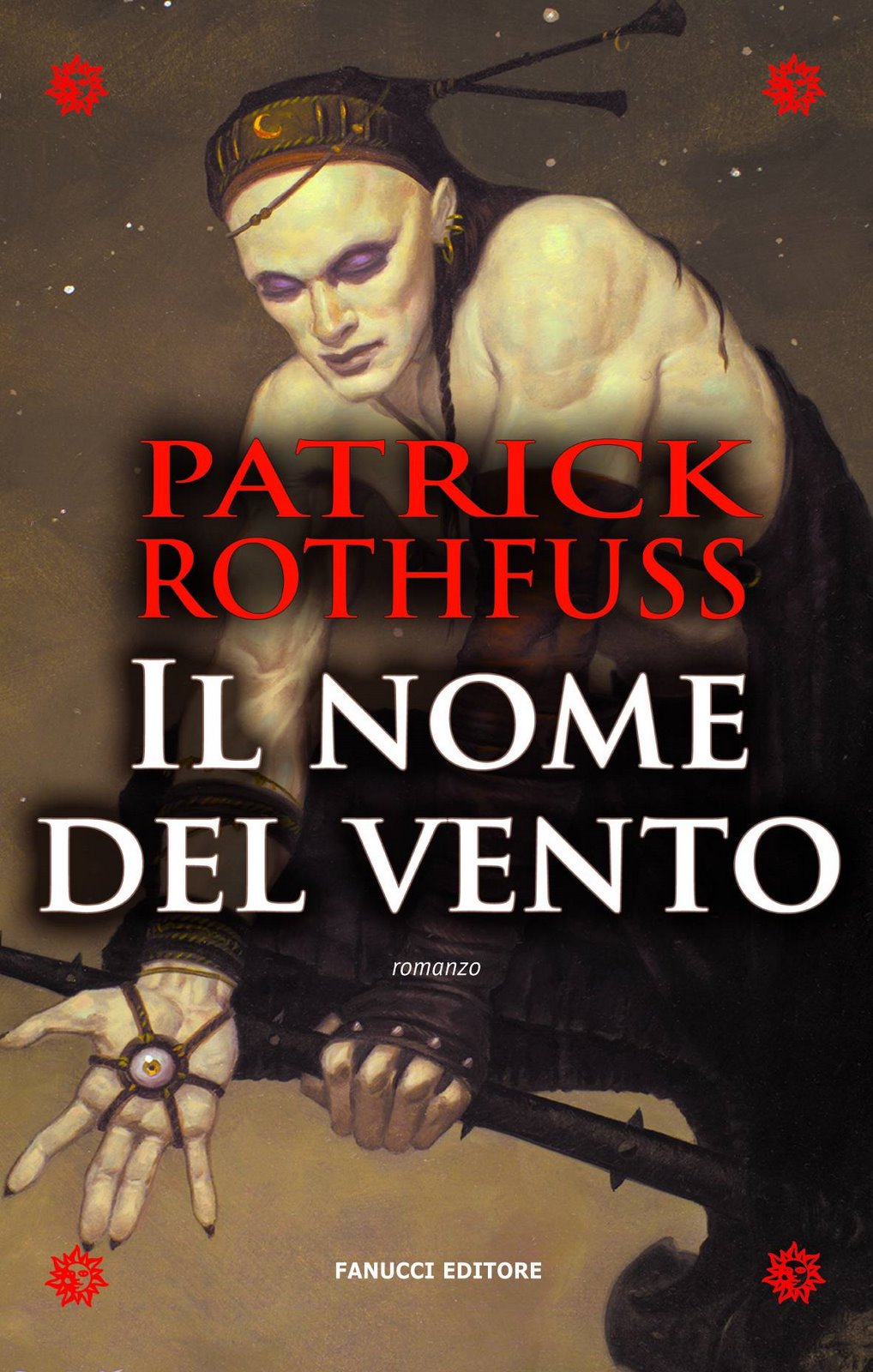
Response to the Italian cover was every bit as varied as I expected. But there was rather more of it than I’d thought there would be. Since there were a lot of good comments and questions, I decided that I’d do a follow-up post to clarify a few things.
Points of interest and/or clarification.
- The art is done by a guy named Brom.
I didn’t know about him before someone made reference to the cover as Brom-art in the comments of the last blog, but I have seen his stuff before. Mostly on D&D books back in the day….
Side note: I am currently working on a theory that once you reach a certain degree of fame, you get bumped up to a new quantum energy state wherein you only need one name.
This is easier to achieve for artists (Donato, Brom) and musicians (Sting, Madonna).
It’s much rarer for authors. I suspect they need way more energy, like electrons in different valence shells. So for writers, only the SUPER elite have enough juice to make the jump (Cervantes, Tolkien, Shakespeare, Chaucer).
- Brom’s website is OVER HERE if you’re interested.
- The art wasn’t drawn for the book specifically. The Italian publisher bought the rights to a pre-existing piece of art to use as the cover for the book.
That means:
- It’s not Kvothe or one of the Chandrian. Don’t sprain anything trying to make that fit in your head. (Though I would like to see Brom’s take on the Chandrian.)
- You didn’t miss the part of the book where someone has an eye in his hand. Neither is the eye-hand a mistranslation issue or some strange cultural signifier.
- My favorite comments on the cover:
- Kip: “It’s obviously a picture of Kvothe LARPing his favorite Vampire: The Requiem Character.”
- “They must have wanted to picture someone with good eye-hand coordination.”
- “NOTW? WTF?”
- Sarah: “Kvothe has some sort of pointy pain stick. He should be careful or it will poke him in the hand-eye.”
A few responses to questions and comments:
“Oh man Pat. As a graphic designer can I just say that that is a bad choice. There is no connection to the book that I can come up with at all. The thing on his hand is so prominent that people are going to wonder why its not in the book. It will be confusing. Then the really bad drop shadow, or black glow around the text is just bad design. The whole composition just was not meant to have text covering it.”
I think you’re right about the composition of the piece. It obviously wasn’t meant to be obscured. I got the permission to show the original artwork from Brom: So here it is…
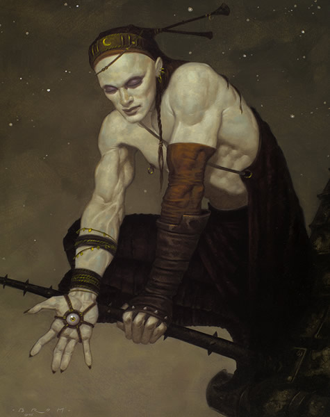
I’m pretty sure that they used that black shadow and my name to cover up Gothy McHotBod’s nipple ring.
And yes, for those of you who are wondering, my chest looks exactly like that when I take my shirt off. By which I mean that I am pale as a bleached ghost on a moonlit night.
Christian asked: “Pat, I am very curious as to who that person is on the cover of the Italian version of your book. I’m pretty sure you would have a big say into what visually depicts your book to first time ( and in my case, long-time) readers.”
Typically, authors get little-to-no say as to the covers of their books. Part of this is because the cover is, ultimately, a marketing choice, rather than an artistic one. And truthfully, publishers know more about marketing than authors do. Also, authors are word-smart, not necessarily picture smart.
That said, in my opinion it is a shame that authors aren’t included in that process more frequently.
I did get to participate in the discussion about my US covers. But that is the exception to the rule, as my publisher, DAW, is very considerate. And my editor, Betsy, respects my opinion on these things. Still, they didn’t say, “what do you think we should do.” they said, “Here’s what we’re planning, what do you think?”
Still, it’s nice to be asked.
My French publisher asked for my thoughts in the planning stage, and my Japanese editor asked early on if I had any suggestions as to who I would like as an artist. But none of the other foreign editors have included me so far. The first time I saw the Italian cover was about a week ago…
In a few of my more recent foreign contracts, I have approval of the final covers. But that doesn’t mean that I get to design them. If the books continue to sell well, I’ll probably get even more say in the future. I’m guessing.
“Why do they keep changing the cover? What’s wrong with original Shirtless Kvothe and Green man?”
Those covers belong to the US publisher. The foreign publishers would have to buy the rights to them if they wanted to use them. They probably don’t want to do that because they’re marketing the book to an entirely different culture.
That’s all for now, folks. I’m back to work on book two…
pat
26 Comments
Your analogy with valence electrons and authors makes me all warm and tingly inside. This is why you’re my favorite author I think. I don’t know many people who are as well versed in so many areas of study that you are.Almost everyone in my unit has read your book now, regardless of if they like fantasy or not (there may have been threats involved in some cases).Also, that cover looks like it belongs on a Magic card.
I thought the same thing about the Magic card. I sort of think that I’ve seen some Brom-art on some Magic cards, but I haven’t checked to make sure that’s true.Pat- will you be appearing in Madison at any free events any time soon or will I have to wait until the next book is released? Not that you’re not worth the admission fee to those events!
Suziko: I’ll probably be doing a Madison Bookstore signing before too long. But it’s kind of a crap shoot. If the store doesn’t want to set something up, there’s not much I can do to make it happen…. But, as always, I’ll mention it here if something like that does happen. So as long as you’re keeping an eye on the blog, you’ll be informed…
To be honest, Shirtless Kvothe and Stone Man don’t do it for me. I much prefer the covers they have here for most books, which I guess is why they have different covers for different markets. (The only exception I can think of is the Harry Potter covers – the American ones are much nicer than the British ones.)
That really clears it all up. It’s interesting seeing behind the scenes with great books. It’s probably not as interesting when you have to do it, maybe a little tedious?I have to say that I really love the Dutchland cover, and the cover for the Wise Man’s Fear. Is that finalized or just an idea they were kicking around the office?
The difference in artist and authors the new quantum energy state,one word name, is self promotion.Artists sign their names on their paintings and single names just look cooler.Authors always write their full name. The more words the better.As a result of Authors love of words however, they have the amazing ability to be multiple people ( multiple names Umm.. whats that called ??? Pesudiiums haha nope any way) Few artist if any ever gain this super hero like ability. Well unless they go crazy. Ps great updates pat
Oh! I just remembered something I’ve been wondering for a while.Are you thinking about doing a second (and possibly third) volume of the College Survival Guide? In the first one, you make references to things that happen in year six and I’m dying to know what it is! You’re certainly prolific and talented enough to merit a second and third volume.
Wow. Thanks for including my question and remarks. Coolness. I think however that the reason for the strong black glow around the text was not to cover the nipple ring. (they could easily have done that by blocking it with the type). I think they realized that with such a busy background they needed to do something to heighten the contrast of your name so it ‘pops’ better. As it should be. Us designers need to have things ‘pop’ you see. All in all it could be worse and I am not Italian so what do I know.Thanks for taking the time to answer the questions though. You continue to rock.
That superpower of wordplay seems to have come into this post quite a bit.The picture is still creepy. Really creepy. But it’s fun to think who in the story is whacked-out enough to have an eye on their hand.Elodin.
I just took a quick look at the Dutch cover. My preference clearly is with the original Kvothe and Stone Man illustration. I actually like the Brom cover, but it really seems odd for TNOW.Until now I’d silently hoped the author had some more say about cover art. I was quite hoping for a Luis Royo illustration for the trilogy I’m working on… Oh well, guess it’s too early for me to worry about that anyhow.Grrr… And of course you have to head to St Paul ten years after I moved back to Europe. Guess you won’t be doing a signing in front of a two man crowd in Luxembourg:-)
Dude… let us know the details of your Seattle trip, oh and don’t bring an umbrella, or you’ll be heckled for being a tourist.Okay, *I’ll* heckle you for being a tourist, everyone else here is pretty nice. ;)-Mark
And truthfully, publishers know more about marketing than authors do.That is, until they slap on a too-dark, low-contrast “Romance-Novel Kvothe” pic and call it “Done”. I’m betting if you’d had more say, you’d have put a stop to it (or, more probably, accepted it anyway, so as not to hurt the artist’s feelings).That said, in my opinion it is a shame that authors aren’t included in that process more frequently.There, see? :)
I figured you didn’t have much choice. But, hey, what can you do? They published your book in Italian!It’s a shame authors don’t have more say, though. After all, who knows a book better than its author?
omg . . . for the Japanese cover, you HAVE to try for Yoshitaka Amano (famous for doing the art for the Final Fantasy series) . . . http://www.amanosworld.com/i would SO buy a copy of that.
That is actually who I mentioned. But not because of the Final Fantasy Stuff.
We can only hope that one day the singular word “Rothfuss” will be mentioned along with other fantasy greats, but today we should morn the loss of an unsung prince of fantasy: Gary Gygax: Creator of D & D.http://blog.wired.com/underwire/2008/03/report-gary-gyg.html
Whoa, whoa, whoa. What’s the answer to the story problem??? I NEED to know!!Just kidding. Sort of. Thanks for the insight on the cover and how all this gets done. As usual, you are the white-chested god of Coolness.Now what’s the answer???
i’m italian, and i’ve just finished to read this marvellouse book i bought one week ago, as soon as it was in the bookstore; maybe the italian cover was not so good, or not very much “appropriate”…but i don’t buy the book for the cover!!!thanks for the strong emotions this GREAT book gave me, francesco
Hey Pat,Any hope that you’ll swing down to Portland when you’re visiting our neighbors to the North?
I claim conspiracy here! Gothy McHotBod, was actually the real reason Auri went crazy, right? That’s totally coming out in book two, I can FEEL it. Seriously though, did they even read the book over there? I can just picture them sitting around a large cherry wood conference table, smoking. (Because I love my stereotypes) “I know the first thing I think of at any point in the story is a muscular yellow man with a nipple ring, bad make-up and poor choice in jewelery and attire.” “Oh, Rinaldo, the eye on the hand has soo been done before.” “No, No Marco. The ladies will shudder in glee at the site of Gothy McHotBod. Trust me.”A hill overlooking a field, with a large rock would have been a better fit.
Hey, Pat, I have a question. Are Waystones in any way inspired by Stonehenge? I keep getting the feeling they are. That’s how I picture them, anyway.Sorry if this is off the subject line. It’s just been on my mind recently, especially after reading that passage of Kvothe’s dream about the double-circle of Waystones.http://www.aboutstonehenge.info/images/education/stonehenge-wallpaper-1.jpg
I ate a plate of spaghetti w/ some some flake like parmesan, and the cover definitely looks better to me. I think I’ll order some cheese stix for the full effect.Looking forward to seeing your smiling face in the NW-c
OK, I had thought the chest-baring, Romance Novel cover was bad, the Italian one was worse. But, still, never judge a book by its cover and it wouldn’t stop me from picking it up and (re)reading it!Still waiting patiently for L.A. to appear on your Tour Schedule. Do you think you’ll make it to Comic Con?
Hi there Pat:Is your book already published in Spain? I am trying to recommend it to a friend there.Thanks!
Sedulo: Nope. I don’t think it will be out there for a year or so….
Book 2, the wise man’s fear – schedualed for 4/7/08 (amazon)- B&N release date 4/1/2010 none in the pipeline none schedualed to arrive – as of 3/31/08. selfishly i am going on a trip on the 8th and would like to have it in hand. any chance the publisher will make the 4/7 date? will B&N be in the distribution loop? Will you be coming to the east coast in the future?