Category Archives: book covers

Name of the Wind – Italian style.

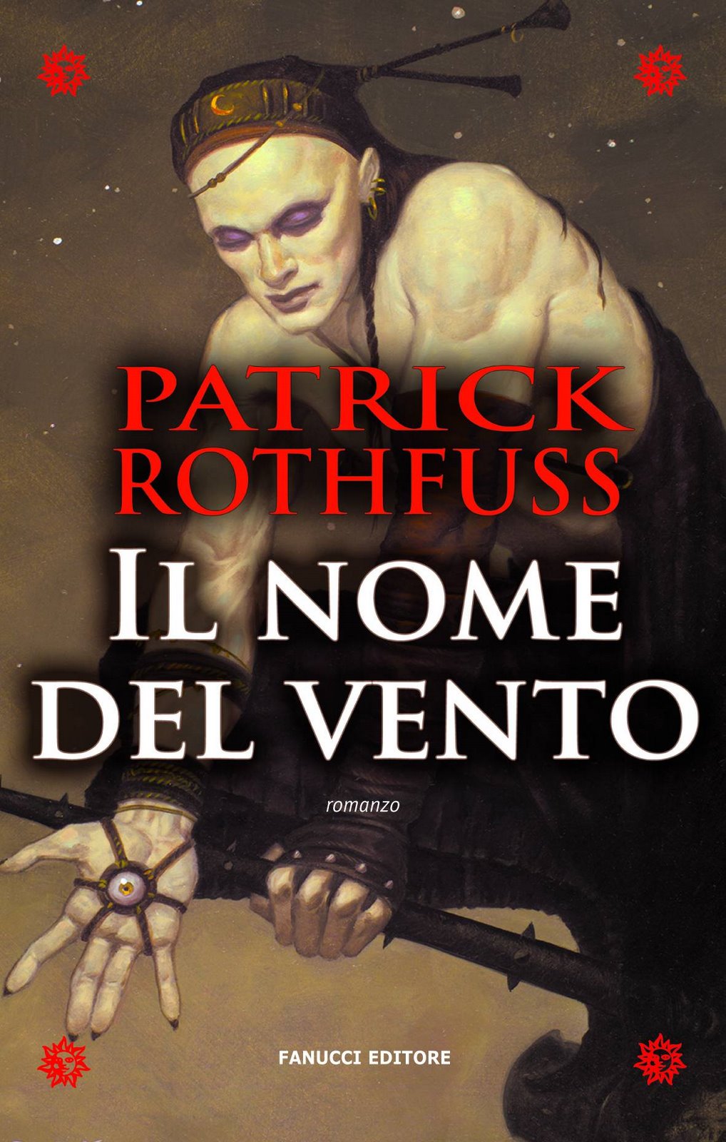
So today is the day that the Italian version of The Name of the Wind hits the shelves. While we’ve sold the foreign translation rights in a lot of countries so far, this is only the second version to actually make it into print, so I’m still experiencing some of that giddy, newbie author joy over the whole things.

I don’t know if it’s significant that the book is coming out on leap day. Except I think it means this book will age more slowly than the other versions of my book, only getting one year older for every seven normal years.

Wait. Seven? No. Four. I was thinking of dog years….

Man. Now I’m wondering what would happen if a dog is born on leap day.

Okay. I can figure this out. I used to be good a story problems, and that was before I studied symbolic logic. Let’s see…

Given – one dog year is equal to seven human years.
Given – those born on leap day only age one year for every four calendar years.

If a dog was born on a leap day, after twenty-one calendar years, he would be:

A) 504 years old.
B) 36 years old
C) 42 years old.
D) Still bound by his duty.
E) Other

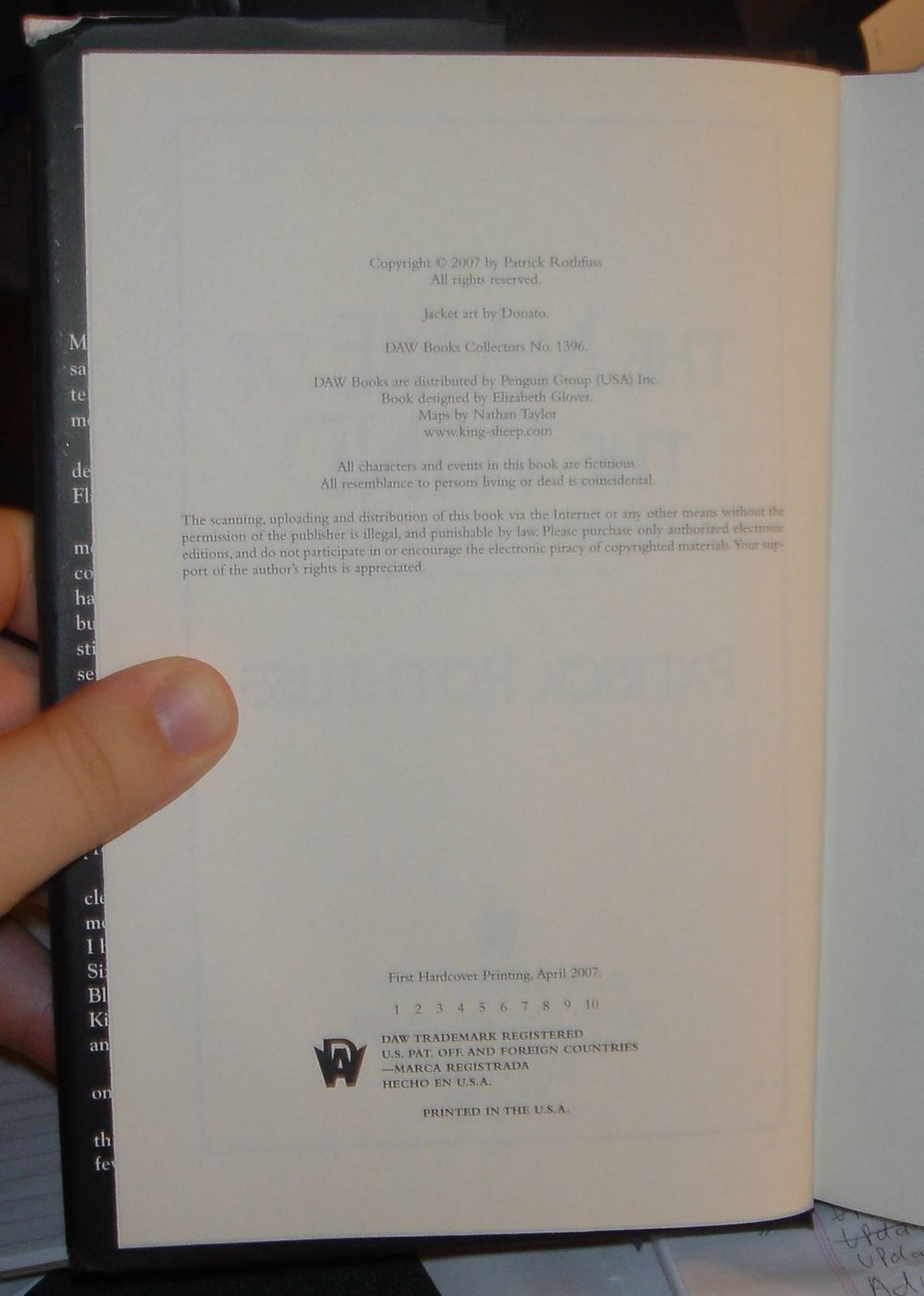
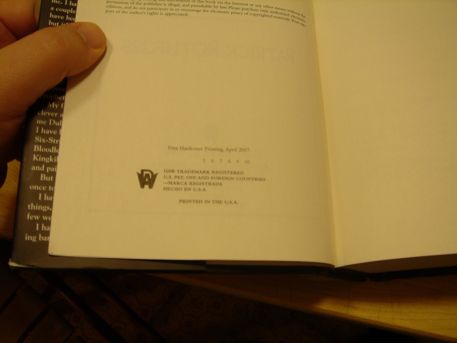
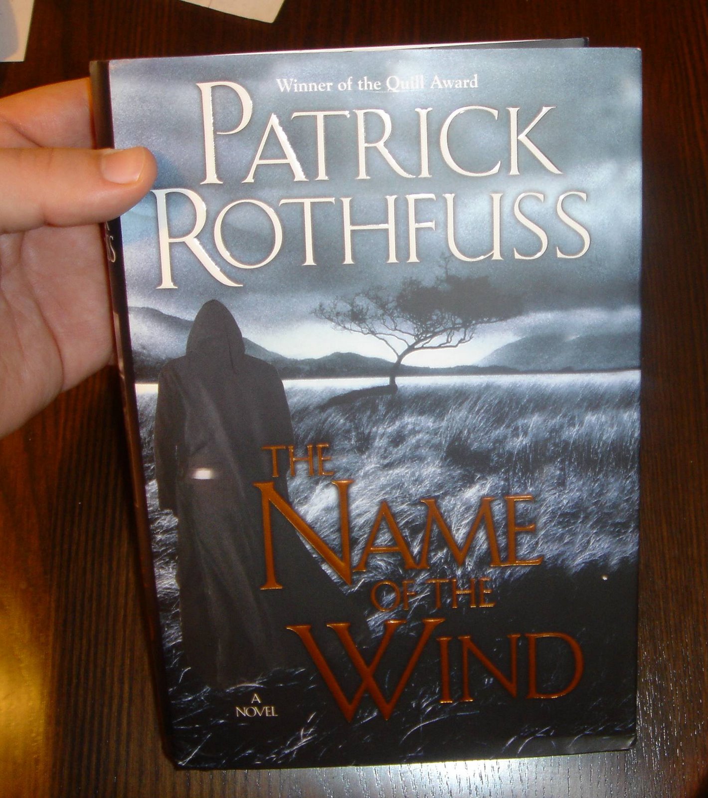
Anyway, back to the Italian translation. I haven’t actually seen the book yet. Not in a real-world sense. I got the editor to send me a nice picture of the cover, but it’s really not the same as holding a real book in your hands. It’s roughly the same difference as seeing baby pictures and holding a baby.

Anyway, here’s the cover. I think you’ll all agree that it’s a whole lot different than the US, UK, and Dutch covers that we’ve seen so far…

(As always, you can click the picture to embiggen it.)
I’m curious what y’all think of this cover, so feel free to drop a comment into the discussion below….

That’s all I’ve got for now. More news is on the horizon, so stay tuned.

pat

Also posted in foreign happenings | By Pat67 Responses

Concerning Printings and a New Cover

Over the last year or so, I’ve learned a lot about the publishing industry.

I’ve always been a big reader, but I never spent much time wondering where books came from, or how they were made. Even when I started working on my books, I focused on the craft of writing, and not the particulars of getting published.

Because of this, I have weird gaps in my knowledge. For example, I just recently learned how to identify different printings of books.

What’s a printing? Well, when your book first comes out, your publisher takes a look at how many books the booksellers and distributors have ordered. Then the publisher prints enough books to cover those orders, plus some extra to have in the warehouse so that they can fill additional orders. That first printing is, well, the first printing.

These first printings can be of wildly different sizes. The first printing of the last Harry Potter book was huge, of course. While a lot of books by new authors get a very small first printings because the publishers don’t know how well the book is going to sell.

From what I understand, a lot of books only get one printing.

But occasionally, something magical happens. Sometimes people keep buying a book from the stores, so those stores keep having to order more from the distributors. The distributors have to order more from the publisher, and then the publisher prints a new batch of the book: that’s the second printing.

And so on, and so on…

I learned all of that fairly early on, but what I *didn’t* know was how to tell the which printing was which. But now I do…

You know that page early on in the book with all that legal-y information on it?

Here’s the one from my book. As always, guest starring my thumb…

Down here is the important bit.

Here’s the tricky part. The line that says “First Hardcover Printing” doesn’t actually tell you anything about the printing. It’s the numbers underneath. Here all the numbers 1-10 are printed out. That means that this is a first printing.

Here’s the second printing of my book. You can tell because the little number one is missing from the list. (Click the picture to embiggen.)

The fourth printing….

And lastly, the fifth printing:

The fifth printing is actually easier to spot than the other ones, as it has one additional subtle difference:

That’s right. The fifth printing of the hardcover got an awesome new cover. I was really flattered that the publisher would do this. I really like the way it looks.

This means that Shirtless Kvothe and Angry Stone Man are a thing of the past. So hang on to them, folks. In five or ten years you’ll be able to e-bay them and put your kids through college.

Also note that this cover makes it very clear that I am a winner, and that The Name of the Wind is a novel. If you were confused about either of those things, you can rest easier now.

Later,

pat

Also posted in Things I didn't know about publishing | By Pat51 Responses

My Awfulness…

In the last set of comments, Mr. Puddifoot called me out. He said that the book I displayed was actually a promotional cover slapped over the top of a plain-old copy of The Name of the Wind.

He was right. The photo was nothing but base trickery on my part, a deception born of my dark, tarlike heart. All I can do is ask for your forgiveness.

Believe me, if book two were that close to being done, you’d be seeing it on the shelves a lot sooner than July of 2008.

As a penance for my horrible tricksyness. I offer up the following:

First, a picture of the UK versions of the book. I just got these in the mail a day or two ago. I think they look pretty cool. Apparently over there, they release the hardcover and the trade paperback at the same time. Go figure.

(You can click the picture to make it bigger, if you’re into that sort of thing.)

Can you see the subtle difference in the two covers? I didn’t notice it while I was taking the pictures, only when I was posting them up here afterwards….

You know that the UK hardcover sells for 19 pounds? That’s almost 40 bucks. I guess I won’t cringe so much at the thought of paying 25 for a hardcover here in the states after this….

Also, I’ve got a new multi-lingual set of interviews for a website called Phantastik-Couch. Bringing my four years of high-school German to bear, I can tell you that this translates as “Fantastic Couch,” or quite possibly, “Fantasy Couch.”

They were nice enough to post the interview up both in ENGLISH and GERMAN, depending on which way you swing.

Back to revisions for me, and sorry about toying with your emotions yesterday. I promise it won’t happen again unless… Well, unless I think of something really funny.

Fondly,

pat

Also posted in foreign happenings, Interviews | By Pat3 Responses

A sneak peek of Book Two…

Well…. just the cover really….

Apparently, it’s a novel….

pat

Also posted in book two | By PatLeave a comment

The UK cover of the book….

For those of you who haven’t seen it yet, here’s the UK cover of the book.

Look at me. I’m all viney.

The book won’t be released until September over there, but apparently the rumormil is already working overtime. I’m excited to see how well people will like it over there….

pat

Also posted in foreign happenings | By Pat1 Response

How cool is this?

Okay. I’ll admit it. I was googling around about my book, and look what I found:

It’s the cover for the Dutch version of the Name of the Wind. Personally, I think it looks cool as hell.

I don’t read Dutch, but I can almost piece together what they’re saying on the publisher’s website. If you’re curious, the page is over here….

Later,

pat

Also posted in foreign happenings | By Pat14 Responses
  • RSS info

  • Visit Worldbuilders!

  • Our Store

  • Previous Posts

  • Archives


  • Bookmark this Blog!

    (IE and Firefox users only - Safari users, click Command-D)