
Before we launch into this month’s Novelties, I’ve got a bit of exciting news.
Our online store, The Tinker’s Packs, has a new… um… store.
Yeah. There’s probably a better way I could have said that.
What I mean to say is that for the last several months, the Worldbuilders team has been working on revamping our online store. The old one was fine back in 2009 when we were only selling a few books and t-shirts, but things have changed a *lot* since then.
These days we’ve got all manner of posters, books, jewelry, signed books, games, bizarre ephemera, books that are also games, and… well… kinda just a lot of stuff.
In addition to being pointedly less geocities than our last store, this store gives us a lot more flexibility in what we sell and how we sell it. Best of all, it’s much more streamlined on the back end (hur hur hur) so that we can ship things more quickly and efficiently. That means not only will it be faster and cheaper for you, but more money will go to Worldbuilders.
So. Now that we’ve got a new store, let’s kick the tires a bit with a few new items, shall we?
- Maplecroft. Signed by Cherie Priest.
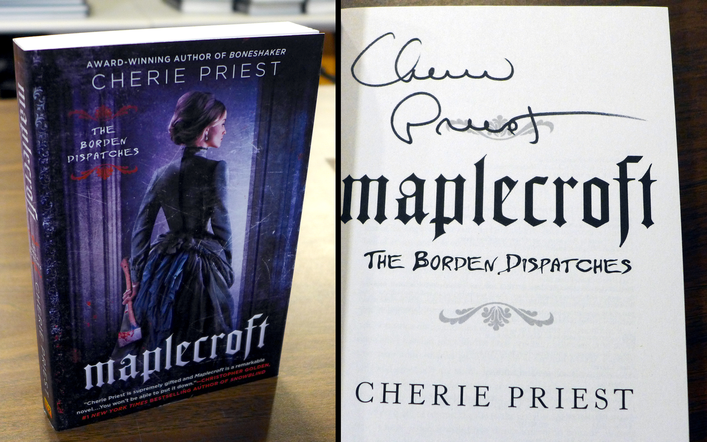
“A mesmerizing, absolute must-read.” – Brian Keene
This is the first book in this new series, and a signed first edition to boot. We have a handful of copies available over here.
- The Mirror Empire. Signed, inscribed, and doodled by Kameron Hurley.
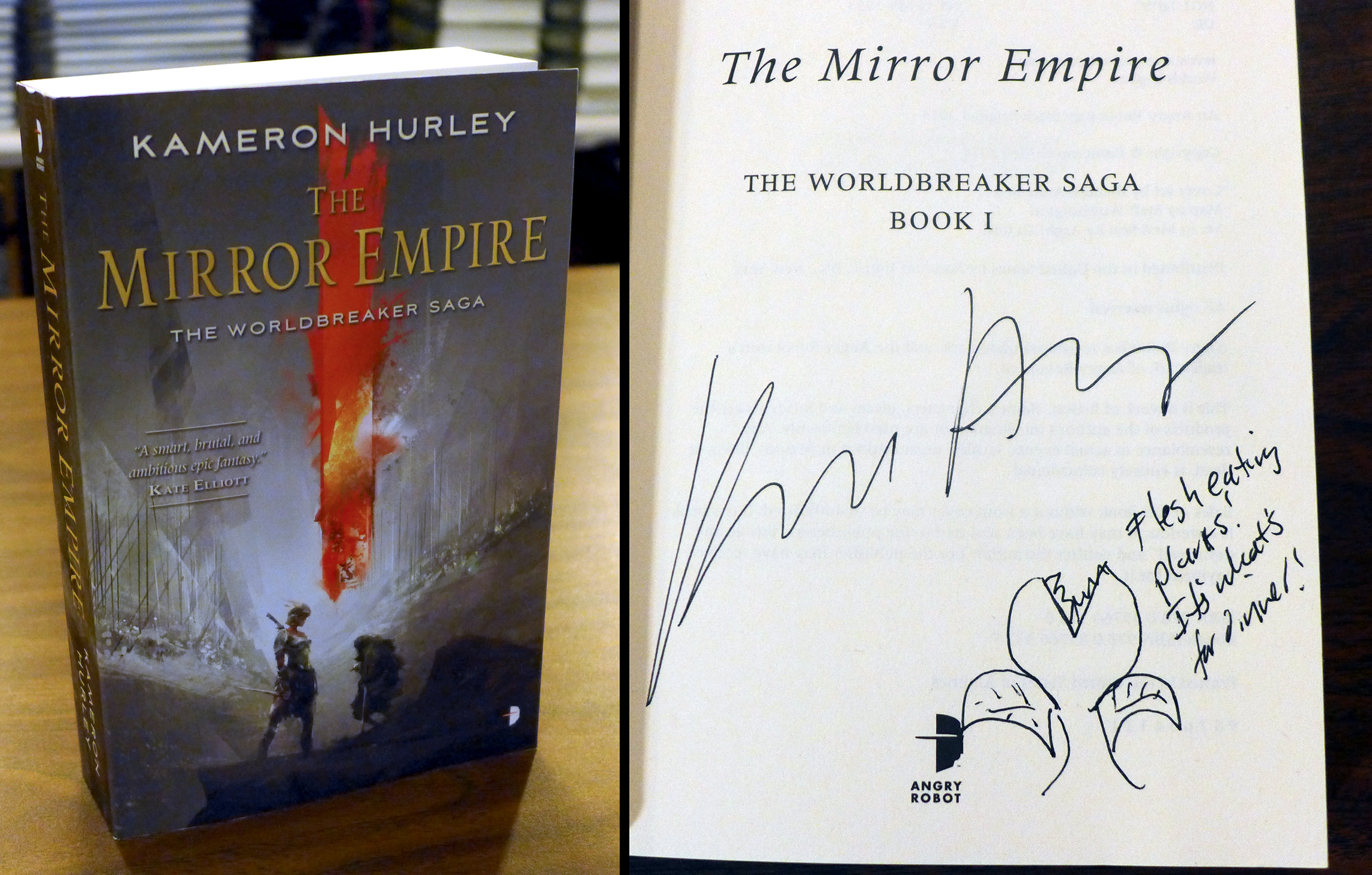
“A smart, brutal, and ambitious epic fantasy.” – Kate Elliot
As you can see, some real love was put into doodling these books. All that love can be all yours (along with an awesome book) if you buy one of our copies over here.
- The Maze of Games. Signed by Mike Selinker, Gaby Weidling, and Pete Venters.
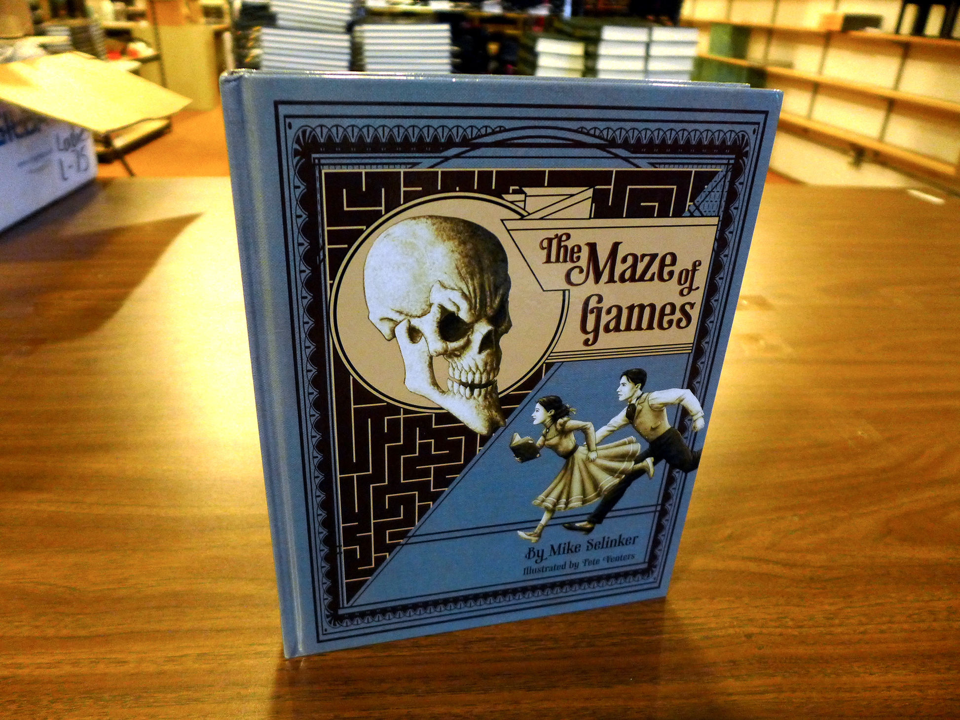
This is a rare creature we have here. A bizzare if not entirely unique combination of game and book. The book itself is printed out of order, and you need to solve puzzles to figure out what page to turn to next.
It’s a brilliant piece of geekery, and we were excited to be able to help show off this beautiful hardcover version here, knowing that a lot of you would never run into it otherwise.
Even cooler is the special puzzles included in each of the 6 copies Mike and Gaby donated to us, but we’ll let them describe it to you…
Yeah. The 6 people who buy this book from us will each have their own, unique puzzle to solve, which then can be combined into one larger puzzle. If that larger, six-part puzzle is solved, Mike and Gaby will donate a goat to Heifer International.
Because I like their style, I’ll match that goat with another goat. If you want to be a part of the coolness, grab a copy over here.
If you’d like to learn more about the book, or would like to order non-signed copies, you can do all of that over here.
We’ve also got a new game in the store this week….
- Get Lucky from Cheapass Games.
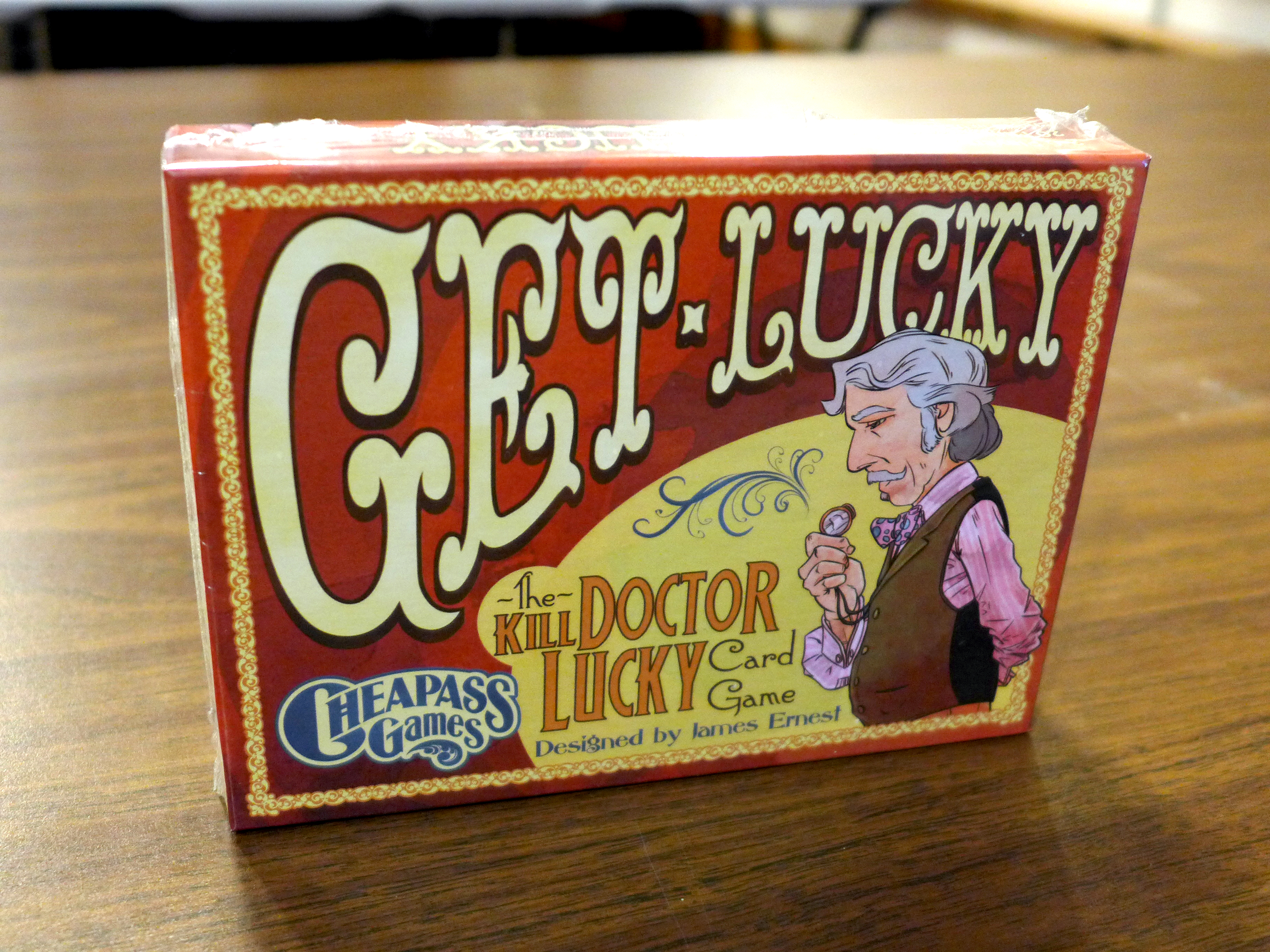
Some of you might have caught this when it was up as a kickstarter when I posted about it on Facebook. If the picture of the game doesn’t jog your memory, maybe this will.
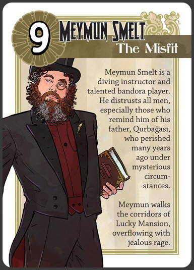
(Yup. I make a cameo appearance in the game.)
Amanda’s been playing this game for months, and digs it. I’m behind the times, and only first got to try it out at PAX.
If you’ve played the board game Kill Doctor Lucky, it’s a card game version of that. If you haven’t, think of this as the prequel to Clue: the players are the people trying to kill a wealthy old man in his mansion without getting caught.
It’s a fun, fast game you can carry with you. Quick enough that you can play it while you’re waiting for your food to show up at at a restaurant, or when family gatherings have gotten particularly boring.
If you want it, head over here and grab one.
And now for something extra exciting….
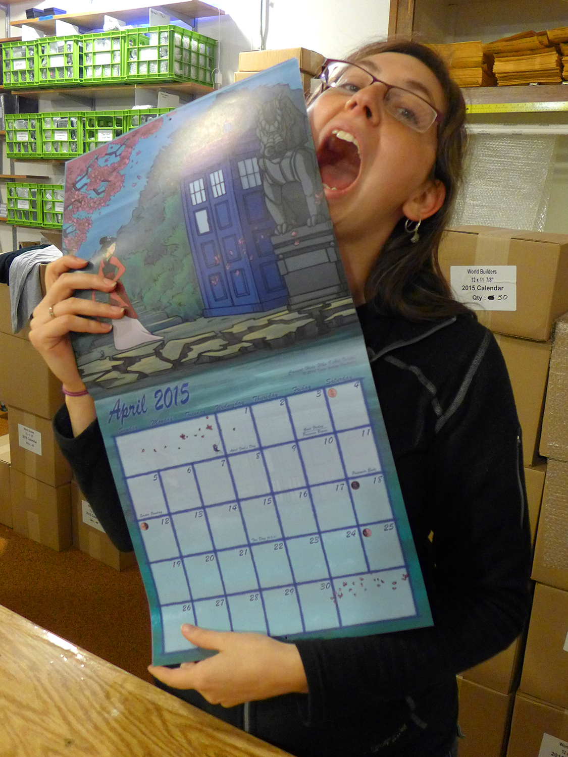
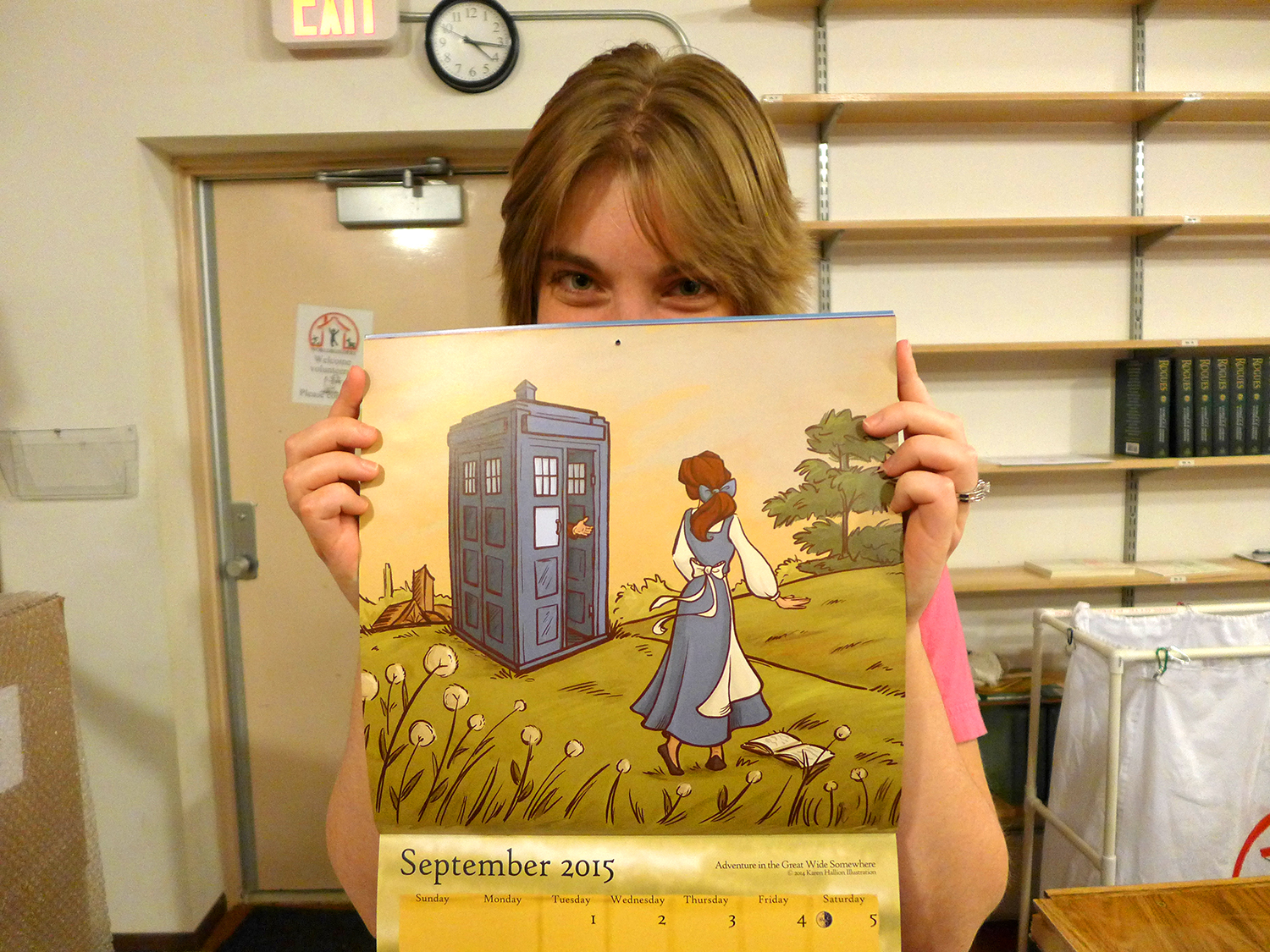
- The 2015 Karen Hallion Calendar.
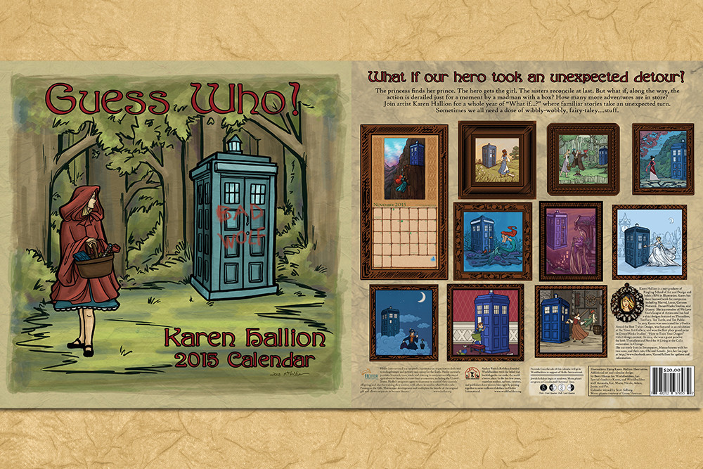
Some of you have already seen this in the Geeks Doing Good fundraiser we ran back in July.
In fact, if you ordered the calendar back then, there’s a good chance you already have your copy. We’re only selling this now because we’ve just finished up shipping out our pre-orders.
If you’d like to see some of the previously unseen pages, check this out.
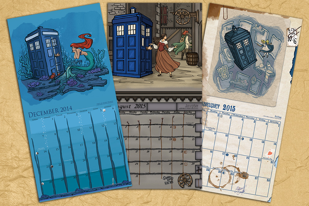
You’ll probably want to click and embiggen that image, if for no other reason than to check out the middle picture. We specifically commissioned it for this year’s calendar, and it features a couple characters there you might recognize….
Needless to say, the Worldbuilders team was really excited to see these come back from the printer.
Everyone has their favorite page:
The sooner you order your copy, the sooner we’ll ship it out to you using our shiny new store.
Also, if you own a store and you’d like to carry copies of these going into the holiday season, drop us a line at calendar [at] worldbuilders.org and we’ll arrange to get you some.
Fondly,
pat
P.S. Stay tuned to the blog, as I’ll be posting up the details of my book tour. Soon.
23 Comments
“In addition to being pointedly less ghetto than our last store…”
Using “ghetto” as an adjective in this manner 80-95% uncool, would suggest re-phrase.
Fair point.
Ahhh, I believe ‘Geocities’ sums up your intended point much nicer, Pat.
Yeah. I’ve always considered “ghetto” to be a word without much sharpness or meanness to it, (largely synonymous with “slum”) but there’s no denying the several layers of racial history attached.
No sense in having that in there unless there’s very specific reason to do it.
For what it’s worth, I almost lost it at “pointedly less geocities than” and I’m in a cubicle amongst dozens of others. That would have been awkward. “Ghetto” wouldn’t have made me laugh at all, so I’m quite happy with this change.
The new shop looks very slick and it is ever so tempting to go on a shopping spree.
Really nice new store! Good job.
That said, two things that could be improved, that I spotted in the first 5 clicks.
1)
Clicks on the scroll banner on the main page opens target=”_blank” (in a new tab) which is very annoying. One page one tab. If I want to open things in a separate one for later I know to use the middle mouse button or Ctrl+click. It breaks navigation with browser back and forward and there is no gain in it.
2)
Although the logo with the donkey is a real winner, taking up about 1/4 vertical viewport space in not a good thing. Looks good on the main page, where it is perfectly fine, but on all other pages it is wasted space.
Good commerce to you.
FAQ 8) has a “mail at paperback.contest @ gmail.com” part. Don’t know if that is intentional, but a {foobar}@thetinkerspacks.com would look better. It also gives a better impression of “we really exist, this is not just a fancy page linking to mailboxes around the globe”.
The main menu uses ‘»’ for drop down (vertical sub), the Breadcrumbs use the ‘»’ as crumb separator (horizontal sub). Something like ‘▼’ would look better in the main nav (e.g. styled color:#8F2314; font-size:0.7em). This is a not solely a subjective question of who thinks what is nicer. ‘»’ implies the right is a sub of the left. Like in math ‘»’ stands for right is much smaller than the left. In the main menu all items are on an equal navigation level and the ‘»’ is bungling things.
Ah! Thanks for the catch. The scroll banner was still linking to the old pages we used to test it, which then redirected to the new page. The jump caused a new tab to open. Fixed!
The logo is a bit large. I liked the extra space it introduces, but good point. We’ll revisit the size, or at least see if we can tone it down on the product pages. We should also have an “@thetinkerspacks.com” email waiting in the wings.
As for the », that’s part of the theme. You raise another solid point, but that might be a rainy-day improvement. :)
Thanks for checking it out!
You are welcome. You guys really all are awesome.
Good to know, that the feedback is appreciated.
The new store is mighty fine, but WHAT has happened to the international shipping prices? I know that shipping is far from cheap, but….
I was looking into the awesome maze of games, shipping to Norway would be either $157 or $170.. Was wondering if this was something special with this book (heavy, extra secured due to super rare or something..) and checked shipping on the Karen Hallion calendar… Cheaper – only a $128 to ship that one.
So, I understand that we non-US folks need to pay a bit extra for shipping, but is it really so expensive? Can’t remember the shipping being this high last time i ordered from the pack (and probably never would if that was the case)..
Still, good job with the new store, guys!
That sounds like a glitch rather than a feature. We’ll look into it. There’s bound to be a few bugs early on….
Wow, thanks for pointing it out. That’s definitely a glitch, and we’re working on it. If you have something you want to get in the meantime, we’d refund you the difference right away to what we’d actually pay for shipping (closer to $38-$40).
That’s sounds more like it should be! Thanks for looking into it!
It was so much fun playing that game with you, James, James’ wife, and the other fan, that I somehow missed that you were on card nine. (Pax is so much fun.)
Wow, great news then. And Amanda looks cute in that picture, I bet you can convince her that this was actually a good move of yours, showing her growling cuteness like that.
So that’s why Denna is so hard to find…
Pat, the calendar is canon, right?
No one has said anything about a BOOK TOUR later this year????? Which book, people??? Slow Regard or Doors of Stone?!!? BOOK TOUR… Sweet sweet words….
Settle down, cowboy. Some people need those question marks you’re throwing around….
For The Slow Regard of Silent Things. Sometime in the next hundred years, the fanfares will sound out when Doors of Stone’s release date is determined, and the sky itself will open, and all will drown in melted chocolate and fire…but until then, silence must reign. Shh…
Damn the calendar looks just awesome, with the internation shipping its quite expensive tho but meh… its worth in every way.
Get Lucky has been our go-to “let’s play a round while we’re waiting for another game to start up” game. So much fun! Out of curiosity, did you contribute more than your amazingly wonderful visage to the character?
Mr Rothfuss,
This is off-topic, but I purchased your book, “Name of the Wind”. I had to let you know I found your usage of the word “lant” in a sentence to be outstanding.
If there were an annual “lant usage” award ceremony, you certainly would have won it that year.