
Today, we bring you Stretch Goal Round-Up, Part Two: Livestreams, Were-Hedgehogs, and Jugglers edition.
I know it’s nowhere near as cool as the last title, but they can’t all be winners.
Today’s blog comes to you courtesy of the Worldbuilders Team. Pat spent the holiday with his family, had a signing down in Madison for IndiesFirst, and promptly come home sick as a dog.
While he sleeps it off, we’re here to grant him a break, as well as to show off the cool stretch goals we’ve passed in the last week, as well as an update on the #NeilReads totals at the end. If you missed the last collection of stretch goals, you definitely should check those out, too.
Let’s get right to it.
- $125k: Seth Fishman hosted a livestreamed Q&A teaching everyone how to write a query letter and/or get an agent.
The livestream happened last Monday, but you can now watch the video right here. Seth talked a lot about query letters and agents, and the dos and don’ts of each.
He even brought on one of his clients, Django Wexler, to discuss the first query letter Seth received from him, and why it didn’t get him an agent.
- $150k: Myke Cole will review Hedging His Bets.
Myke helped us get through the technical issues we had with this video, and it’s up in all its glory for you to see.
If you’ve ever wanted to read were-hedgehog erotica, but wanted to hear a review of the book first, you’ve got it here.
- $225k: James Ernest will post a video of his signature juggling trick.
James was a juggler and performer before he made it as a game designer, and this trick is his signature trick, that only he performs. Yup. Juuust him. Sure would suck if someone stole his move, made it famous, and gave him full credit. Sure would. Enjoy all of its majesty…
- $250K Nate Taylor & Pat stream a discussion about the art of Slow Regard.
Nate and Pat had a great time talking about the art from Slow Regard. When you’ve got an hour to spare, be sure to sit down and watch this one.
We passed both of these next goals over Thanksgiving, so the videos aren’t ready yet, but they will be soon!
- $300k Mikey Neumann writes and reads a short story just for us!
Mikey has been planning this one for a while, and we’re pumped to share it with you once he finishes and films it for us…
- $325k Christopher Paolini reads from “The Eye of Argon.”
“The Eye of Argon” considered the Citizen Kane of bad fantasy writing (or maybe the Plan 9 From Outer Space?), and has been embraced in its infamy by writers and fans alike. Apparently, reading this story has turned into some kind of competition. Folks are challenged to read it, exactly as written, without smiling or laughing. Grandmasters have to read it after inhaling helium.
This is going to be good, no matter how Christopher handles it.
And we’re right on the cusp of the next couple of stretch goals as well…
- $350k The Doubleclicks play “Love You Like a Burrito” with a special guest…
This special guest may need to redeem himself after not performing the song very well at a book release event in Portland a little while ago…
- $375k Cards Against Humanity livestreams a day of gaming with Pat.
This one is going to be epic as well, and the folks at Cards Against Humanity are awesome. If you didn’t see CAH’s Black Friday Bullshit sale, you really missed out on your chance to buy real, literal bullshit.
- $400k John Green eats a Heifer International inspired meal.
Followers of John Green may already know of his history of blenderizing meals. He’s agreed to eat a meal made up of things you can get from Heifer International: Goat cheese, bacon, honey, and lots of other things he might be able to find. It’s probably going to be really gross, in a really awesome way.
* * *
I (meaning Amanda) ran all the numbers this morning to see what animal Pat may have to kiss if we pass our total from last year:
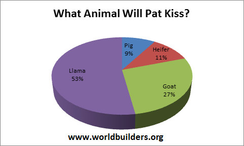
It seems pretty solidly decided in favor of llama.
There were comments here and there of people trying to campaign for the Goat, mostly to spare Pat from what has potential to be a very scary experience with the llama, so we’ll see if they’re successful in the end…
As far as the #NeilReads totals, we’ve got quite the turn of events. I went to run my totals, and when I got the image to share with everyone, it turned up like this.
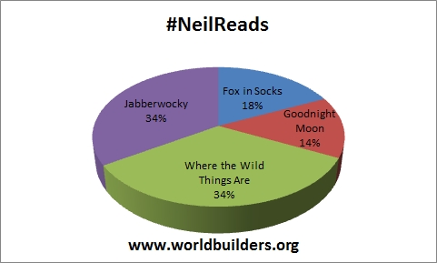
I did a double take when I realized that Jabberwocky and Where The Wild Things are were tied. I’d taken it for granted at this point that Jabberwocky would still have a perceptible lead. Since I didn’t think it was fair to show you this without offering up the detailed totals, I did a new chart with those included as well.
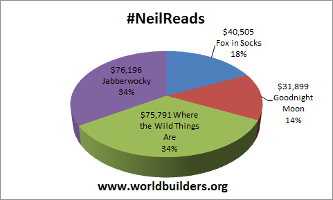
So that’s where things currently stand – Jabberwocky is winning with a mere $405 lead. If you want Where the Wild Things Are to win (I know I do), go in there and vote, or get your friends to vote. It won’t take much…
Hope you all had a great weekend. Stay tuned to the Worldbuilders Facebook page and/or Twitter feed, because we’ll be updating every day with things you won’t want to miss, including a massive blog tomorrow full of books from DAW.
The Worldbuilders Team

12 Comments
I’m glad he’s going to have the chance to redeem himself for the Portland debacle. I mean, it was adorable, and I loved watching it, but I know he can’t want that to be the final version of how the version of the song with him goes. I mean, we all know how much he likes revising;-)
Naw, the only debacle in Portland was when Pat didn’t answer my question!
(I kid! I felt lucky that he read the whole damn thing, hmmmming and oh-ing and ah-ing…)
As someone who cares about how data is represented (I am a biomedical scientist working with large datasets, so I am literally paid to care about this), could I make a plea to you not to use 3D pie charts to represent, well anything at all really.
The 3D perspective they use distorts data horribly, as can be seen in the #NeilReads chart in which Where the Wild Things are appears to be winning comfortably even though it is losing slightly to Jabberwocky (in fact they are often deliberately used to lie to people about data in exactly this way). 2D pie charts are better, but they still make small differences between groups hard to spot, so bar charts are best of all.
I get where you’re coming from, but do you have any suggestions for better representation of data that don’t look…. well…. Boring as hell? A bar chart isn’t very compelling or intuitive….
There’s a line between compelling and misleading, and 3D pie charts are on the wrong side of it. cf. http://fury.com/2010/03/why-3d-pie-charts-are-bad/
Again I say: how about a suggestion for something better? If anyone out there would like to turn that data into some platonic form of Pie Chart that is both accurate, attractive, and easy to absorb, I’d love to see it. We’d use it. Seriously.
Right now everyone is just pointing and saying, “Fire Bad!” It’s not really… y’know… solution oriented.
I’m not exactly sure how much extra time/effort this suggestion would take, so it may not be feasible, but if you took the percentages from the charts and used them to scale a shape? Say… a heifer? Then you’d have a small red cow for GNM, a slightly larger blue cow for FiS, and two equally large cows (green and purple, respectively) for Jabberwocky and WtWTA showing the tie? Then just put them in a row, with Jabberwocky first since it’s leading?
I don’t see how it’s that important, in this context.
Also, I am not sure what program is used to generate the charts, but in MSWord you can rotate the chart. It might make some feel better to see the division between Jabberwocky and Where the Wild Things Are directly centered, so that the 3-D perspective does not unfairly warp one more than the other?
(My apologies. It appears I cannot edit my previous comment, and once asked for solutions I can’t keep them to myself.)
Sorry for the delay in replying – I forgot to check back here for a few days.
I’ve been having a think about this, and I think a coxcomb plot might be a good choice – it’s a pie chart where the angles are all equal, but the radius changes. It also has a wonderful alternative name – the Nightingale rose diagram, as it was invented by Florence Nightingale, who I have just learned was a pioneer in the graphical representation of statistics. It’s more commonly used for cyclical data (e.g. months in a year), but I see no reason why it can’t be used here. For a quick mock-up (obviously things could be prettified further) see here: https://flic.kr/p/qhTFcP
The only downside is that excel can’t produce these plots (at least not without some seriously ugly kludging) – I did that example using the ggplot2 package in R (a statistical programming language). In excel a donut plot might be suitable – it looks prettier than a 2D pie chart, but isn’t as misleading as a 3D one.
Finally, while I have your attention, let me say that I have just finished The Slow Regard of Silent Things, and it was unutterably beautiful. I have never seen an author show such thoughtful tenderness and love towards one of their characters. Thank you.
Oh, in case it wasn’t clear, the data I used for that coxcomb plot is from the latest post (4th Dec), rather than this one.
Telyni’s cone plot below would also work well.
Neil Gaiman should read SLOW REGARD!
I fully agree that the pie charts are misleading. It’s a simple thing – even with 2D pie charts, it’s just very difficult to compare the relative sizes of wedges, especially if they’re close in size. With the 3D angle, the apparent sizes become not just similar, but wrong. Our brains are much worse at comparing angles or areas than comparing lengths, anyway.
For this purpose, just about anything would be better than a pie chart, but the best is probably some kind of bar chart. Bar charts don’t have to be boring, though, even if they’re from Excel. Here’s a link to a cone chart that illustrates the main point (that Jabberwocky and Wild Things are neck and neck) without using most of the defaults that make many Excel graphs boring: http://tinyurl.com/oqvn9ba